Wednesday, May 11, 2011

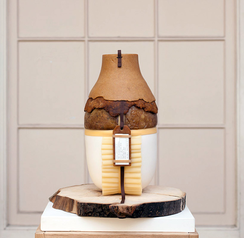
formafantasma: botanica


'botanica' by formafantasma
all images © luisa zanzani


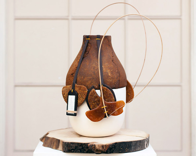
the results of an investigation into polymers, plants, and the history of plastics, 'botanica' has been designed 
by the italian-born, netherlands-based studio formafantasma (andrea trimarchi and simone farresin) for plart
a foundation dedicated to the research, restoration, and conservation of works of art and design produced in plastic.


the entire 'botanica' collection, curated by marco petroni


at one time, plastics were heralded as the exciting 'material of the future', but have since come to be commonly regarded 
as representative of a mass consumerist, ecologically unsustainable period of industrial production. for the project, 
curated by marco petroni, formafantasma investigated natural, plant and animal-based polymers, including rosin, 
dammar (a varnish tapped from trees), copal (a sub-fossil state of amber), natural rubber, shellac (extracted from insect excrement), 
and the 19th-century plastic-like bois durci (composed of sawdust and egg or blood).

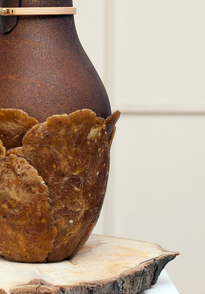
in the pieces they produce, the natural textures and colours of the resins create an effect not completely unlike 20th-century bakelite products,
but the overall aesthetic of the works themselves instead attends simultaneously to the historical periods before and after the oil era,
offering archaic-like forms and assemblages curated with a contemporary perspective.

in 'botanica', the designers note, modern plastics are indeed used amidst the natural polymers, but 'as precious details
rather than the foundation of the pieces, 'in an attempt to develop a new post-industrial aesthetic.'


detail view of the piece


tokujin yoshioka: 'O' for issey miyake watch project


'O' by tokujin yoshioka for issey miyake watch project
all images courtesy of tokujin yoshioka 

on the occasion of celebrating the 10th anniversary of the issey miyake watch project, in development with seiko instruments
japanese designer tokujin yoshioka has created 'O'. in french, eau (pronounced 'O'), means water. 
tokujin has created this timepiece making it look as if it is sculpted from water, a block of ice, 
resulting in a transparent bangle with a smooth curvature, that reflects its surroundings. the design, 
with its non-definitive liquid form like water, seems to blend into the environment, as if it were disappearing from itself. 
the watch is set to be released at the beginning of july.


profile
  
3/4 view


the design looks as if it is sculpted out of water


'O'

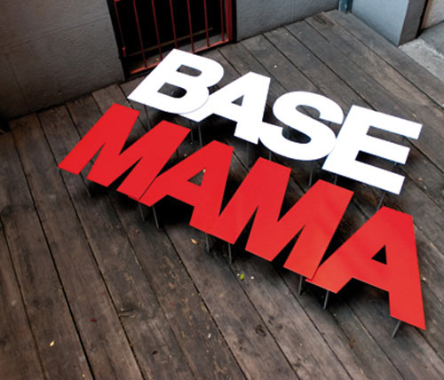
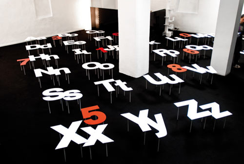
Fontable by Alessandro Canepa and Andrea Paulicelli

Font nerd alert! Here's a three-dimensional way to express your love of letters.

Fontable by Alessandro Canepa and Andrea Paulicelli

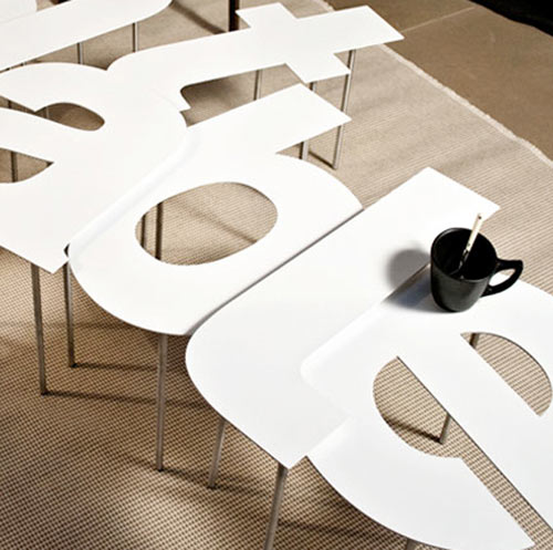
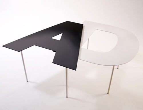
The Fontable, designed by Alessandro Canepa and Andrea Paulicelli is a new concept featuring letters A-Z in lower and uppercase as well as the numbers 0-9. Each table is made from a single sheet of steel in white, black or red. The adjustable legs are anodized aluminum.
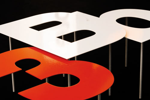
Fontable by Alessandro Canepa and Andrea Paulicelli

Fontable by Alessandro Canepa and Andrea Paulicelli

Fontable by Alessandro Canepa and Andrea Paulicelli

Fontable by Alessandro Canepa and Andrea Paulicelli


Pinch Food Design

Pinch Food Design

Pinch Food Design is a new NYC-based food and design company that is launching this month. Pinch's co-founder (and former set designer) TJ Girard has designed a series of food serving products that are not only functional, but go the extra mile in both design and features.

Paying equal attention to food and design, Pinch has re-imagined every aspect of entertaining.
Pinch Food Design

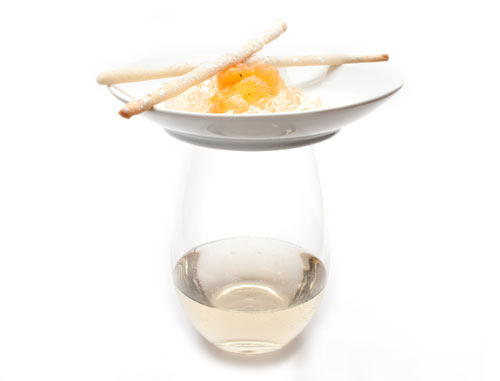
Pinch Bowl
Anyone who has ever stood at a cocktail party holding a drink and a plate of food will surely appreciate this ingenious idea: a crisp white ceramic plate/bowl designed to rest securely atop a wine or drink glass, enabling guests to eat with a fork while holding a beverage.

Pinch Food Design

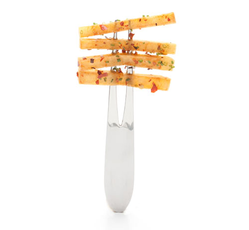
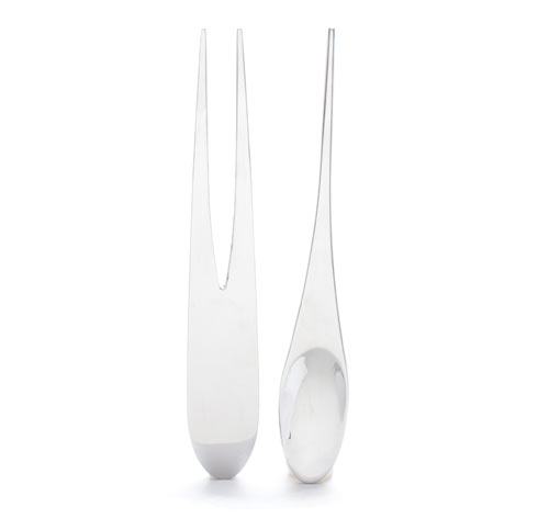
Pinch Fork
A sleek high-polished stainless steel utensil with two prongs, the Pinch Fork is ideal for serving several layers of food without compromising the integrity of the individual ingredients; it's also a beautiful way to display and serve a perfect forkful of flavor.

Pinch Food Design

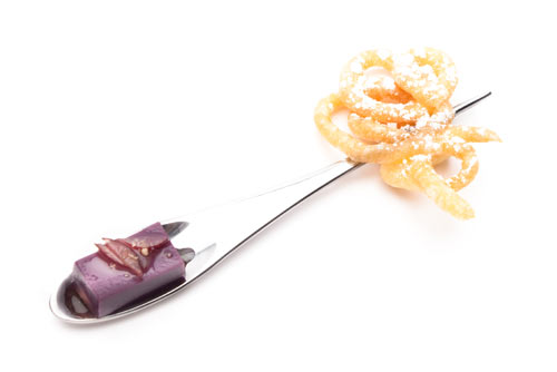
Spin
Part skewer, part spoon, this stainless steel implement allows guests to "spin" from a dry ingredient to a liquid or wet ingredient with ease. For example, peanut butter funnel cake and concord grape panna cotta, or saffron mussels and broth-soaked bread.

Pinch Food Design

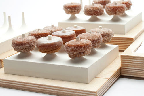
Spoke Tray
Various wood bases made of Baltic birch with an indentation to hold the ceramic Spoke components and some napkins. Perfect for mini-doughnuts.

Pinch Food Design

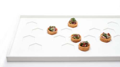
Honeycomb Tray
A tray made of glossy white acrylic with various components. A second layer, or liner fits into place with honeycomb-shaped cutouts designed to make sure food stays in place. The top layer is removable so you can use the tray alone as well.

Pinch Food Design

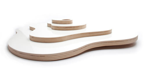
Amoeba Tray
The Amoeba Tray consists of four concentric tiers, each one a perfect platform for presenting hors d'oeuvres. Available in a white glossy finish, this sophisticated serving implement has a distinct organic sensibility in its design. The center of the tray is slightly sunken to form a shallow vase for decorative and aromatic herbs.

Pinch Food Design

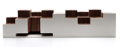
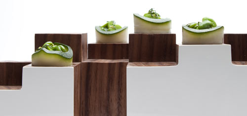
Walnut Matrix
Pinch's rendition of a tray, the Walnut Matrix is more of a functional sculpture, and would look as stunning holding food as it would as a decorative centerpiece. Architectural in design, the Walnut Matrix is a series of blocks in different heights, each one crafted in walnut, a beautiful contrast to the white glossy base. The surface of the blocks serves as little pedestals for hors d'oeuvres, and each surface has a subtle dip to ensure the food doesn't slip. The base includes a built-in compartment for napkins, or napkin nook, a clever and thoughtful design feature found in many of Pinch's passing trays and food stations.

Pinch Food Design


Hacienda by Stanley Ruiz

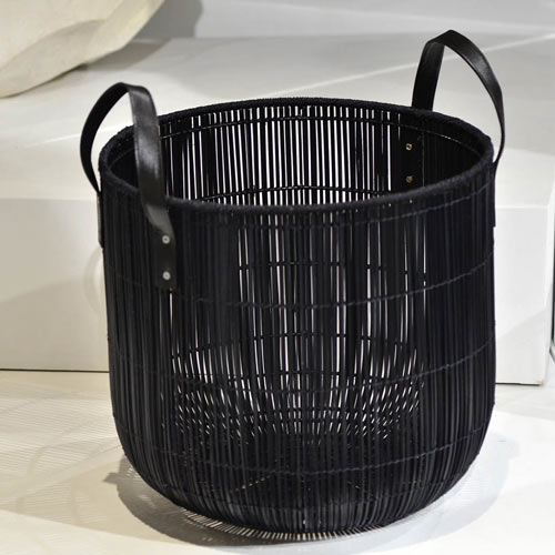
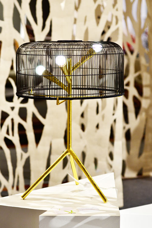
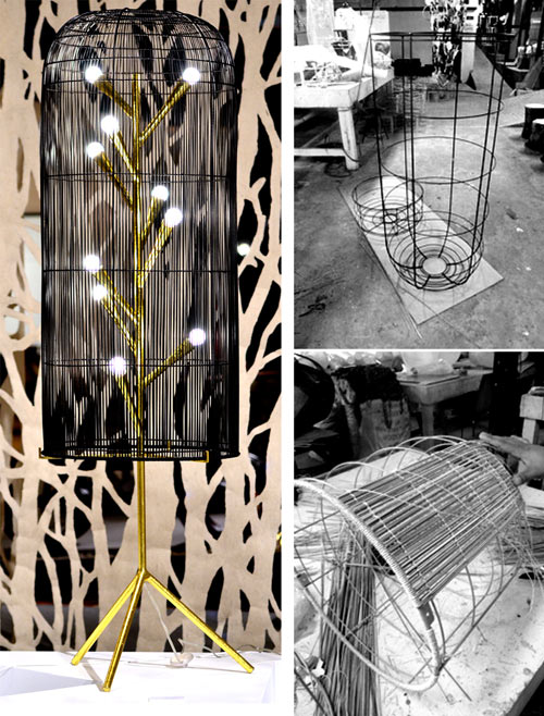
Hacienda is a collection of products made of palm reed (buri), leather, and metal by Brooklyn-based designer Stanley Ruiz. Designed for the company Hacienda Crafts (based in the Philippines), a sugar plantation that started producing handicrafts in the 90s with the mission of generating countryside opportunities by providing an alternative livelihood for the farmers and their families. The collection includes the Branch floor lamp, Branch table lamp, and a set of three natural and three black Pandora baskets.
Hacienda by Stanley Ruiz

Hacienda by Stanley Ruiz

Hacienda by Stanley Ruiz


Nzela Table by Kayiwa

modular table Modular Table

The Nzela Table by the Finnish company Kayiwa is a colorful and modular table with many different configurations. The table can be rearranged in some combination in accordance with any space. There is no tools equipment required means that only 3 minutes to collect, make fast, assembly and disassembly are both easy and so with storage. It looks great in neoplastic color scheme, but the color and variety in the glossiness can also be personalized from Kayiwa.

Nzela Table by Kayiwa Modular Table

modular dining table Modular Table

contemporary dining table Modular Table

modular tables Modular Table

contemporary dining tables Modular Table

modular dining tables Modular Table

Description

  • Material: Birch Plywood
  • Length:148 cm
  • Height: 74 cm
  • Width: 148 cm
  • Weight: 95 kg
  • Shipping Weight: 100 kg
  • Table leg(s)
  • Length: 209 cm
  • Height: 74 cm
  • Width: 2.1 cm


Tip Ton Chair by Edward Barber & Jay Osgerby for Vitra


tipton by Barber Osgerby Plastic Stackable Chairs

At 2011 Milan Furniture Fair, Vitra presented Tip Ton Chair from collaborations with London designer Edward Barber & Jay Osgerby. Tip Ton chair converges sustainability and ergonomics into a new chair typology. This simple design transform plastic chairs both functionally and visually.

Barber Osgerby, 2011
Tip Ton defines a whole new chair typology: the solid plastic chair with forward-tilt action. Its name refers to the two types of sitting experiences that characterise the chair – from a normal position, Tip Ton can be tilted a few degrees forward where it then stays in place. The innovation behind this seemingly simple feature lies in the skids, which rise at a nine-degree angle. The forward-tilt sitting position, until now the preserve of mechanical office chairs, straightens the pelvis and spine and thus improves circulation to the abdominal and back muscles. Thanks to its striking appearance, Tip Ton is an outstanding dining table or home-office solution; it is also ideal for use in restaurants, conference and meeting spaces and educational institutions.

plastic chair Plastic Stackable Chairs

plastic stackable chairs Plastic Stackable Chairs

stackable plastic chairs Plastic Stackable Chairs

plastic chairs stackable Plastic Stackable Chairs

plastic stack chair Plastic Stackable Chairs

plastic chair from vitra Plastic Stackable Chairs

plastic chairs Plastic Stackable Chairs

plastic stacking chair Plastic Stackable Chairs

Sunday, May 08, 2011

Spin Recharging

A close cousin of the Mechanical Mobile, the revOlve cellphone loves to spin. A notch up as far as physical design goes, the main differentiating factor are the detachable components that can be upgraded and recycled when necessary. I love the sleek holster and the way you can buckle the phone to your waist loop. Let's spin and wait for the magical mechanics to take over!

Designers: Da DengChandra BakerChris Platt & Jason Schuler


----------