Monday, August 17, 2009

8/18 Yanko Design

Please add updates@feedmyinbox.com to your address book to make sure you receive these messages in the future.
Yanko Design - Modern Industrial Design News Feed My Inbox

Brush Patterns
August 17, 2009 at 2:36 pm

Miranda is a surface tile with hairs that can be manipulated to create different shades in the surface. These shades can be used as a medium for illustration, communication or visual effect. Miranda is an adaptable wall mural measuring 3 square metres and composed of silicone wall base tiles with over 65,000 injection moulded polypropylene fibers sitting in tiny ball and socket joints on the surface of the wall. I used to do this with my parent’s carpeting. About time somebody made it into a product of high art.

Designer: Giles Miller

miranda

miranda2

miranda4

miranda3

Miranda Wall Mural by Giles Miller

miranda6


Monitors Your Health, Draws Blood
August 17, 2009 at 2:30 pm

The  < yu: > enables real time biometric feedback - the kind of information that could revolutionize medical diagnosis. It’s a soft bracelet mesh that checks your vital signs and even draws painless blood samples. It interfaces with you computer and acts as an alarm clock by applying pressure. With a flick of the rest, the device tightens and takes real time biometric readings to be transmitted to a computer and physician.

Designers: Ewald Neuhofer, Talia Radford, Thomas Schiefer & Georg Milde

<yu:>  EXT AVANCED MEDICAL DIAGNOSTICS by Ewald Neuhofer, Talia Radford, Thomas Schiefer & Georg Milde

yu2

yu3


Shoelaces Not Needed
August 17, 2009 at 2:18 pm

Everyone knows how to tie shoelaces but most don’t know how to properly adjust them. That uncomfortable shoe could just be a matter of tension. Technically you should readjust every 4-5th wear. Why even bother if there’s something better? The No Shoelace Shoe uses a single strap that wraps around the entire width of your foot’s arch. By simply tightening or loosening a velcro strap, you achieve the perfect fit. Designed for runners but this simple design could easily translate into any footwear.

Designers: Seon-Keun Park & Jin-Sun Park

No Shoelace Shoe Design by Seon-Keun Park & Jin-Sun Park

no_shoelace2

no_shoelace3

no_shoelace4


Revolving Part II
August 17, 2009 at 4:05 am

Before you guys go ballistic that you've seen this concept before, let me point of the differences…the previous one MAGI, was a light concept where as this one is an MP3 Player concept. In the lights one, the on/off switch rotated to increase the intensity of the light and here in the MP3, it rotates to reveal the controls of the player. Too much "inspiration" going on here…so I leave it to you guys to sort this one. Cool earbuds tho.

Designer: Rho Jung Chan

MP3 Player Concept by Rho Jung Chan

mp32

mp332

mp34


Confused Between Mensuration And Menstruation?
August 17, 2009 at 3:40 am

I am having a crass sense of humor today thanks to designer Andy Kurovets, who brings us the Hygienic Sanitary Pad Layers Table and Sanitary Tampon USB! As if it wasn't uncomfortable enough watching those adverts on the TV where "Blue Water" was soaked up by a pad, that now we gals have to endure an entire shelves-table depicting the layers of sanitary napkin soaking up the actual stuff. Maybe the boys need to know the difference between Mensuration and Menstruation!

Please note: this project was meant as a lighthearted Monday Morning Blues remedy (similar to the PMS we women face) and is not to be taken seriously

Designer: Andy Kurovets

Hygienic Sanitary Pad Layers Table and Sanitary Tampon USB by Andy Kurovets

hygienic2


R U Down W/ Fluorescent?
August 17, 2009 at 3:01 am

The quest for the new fabulous lighting fixture continues. What have we got here? A spaceship named “Sputnik.” Our newest obsession Oliver Schick has this T-8 fluorescent tube pendant luminaire whipped up and ready to take on the 70’s today! In an effort to revitalize the “clunky” ringshaped tube of that Star Wars era, Schick creates this space-inspired hanging lamp to keep the “time-tested” lighting solution alive!

According to Schick, fluorescent lights are still worth the time and effort companies put into them. Now he didn’t use those words exactly, but building a lamp around them certainly evokes such thoughts!

Now check this out: here I am, Chris Burns, design and green conscious new apartment owner - I want to know if Schick has the best solution to lighting a modern abode. I need your help to figure this out! My question for all of you is: if you were to purchase (or make?) a lamp right now, which one in the whole world would you choose?

Designer: Oliver Schick

sputnik01

sputnik02

Sputnik T-8 Fluorescent Tube Pendant Luminaire by Oliver Schick


To Shave All Areas
August 17, 2009 at 3:01 am

Yes if you, too, would love to evolve and cut off all that hair you’ve got on your body, you gorilla person, then you’ll be glad to know there’s now one SINGLE tool to do it all. The “All Area” shaver by designer Jonas Buck. Take this info from a couple of Ken dolls and discover for yourself what hair goes and what hair stays.

So first - the Ken Dolls. They are standing there in all their glory with dots all over them. The dots represent the survey results of 13 students (college aged and older,) male and female. What these students were asked was to show where they feel a MALE person should shave.

That’s not to say this lovely monster couldn’t work on a lady, but this was the first target. The results of this survey told designer Jonas Buck that most people cut hair off more than one place on their body pretty often. Thus: the “All Area.” It’s a razor and a trimmer in one, plus it’s got lovely length attachments to be used on longer hair. Everything you could want with a really nice-n-cute power button.

I foresee no problems!

Designer: Jonas Buck

allarea01

All Area Shaver by Jonas Buck

allarea03

allarea04

allarea05

allarea06

(Don’t you just LOVE that doll chart?! I can’t get over it!)


Heavenly Abode
August 17, 2009 at 3:00 am

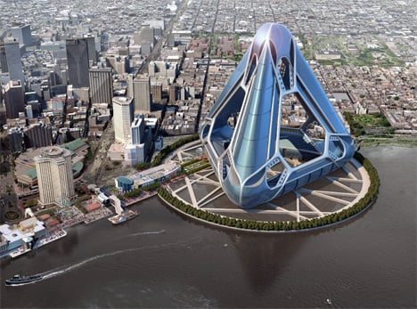
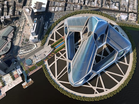
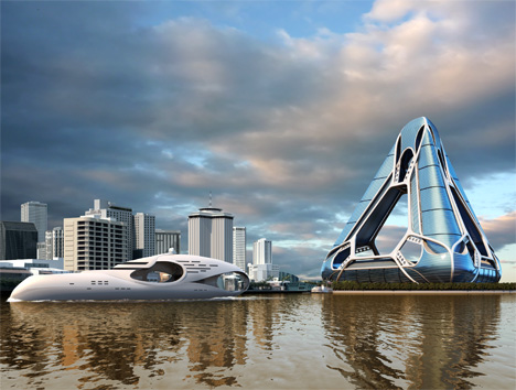
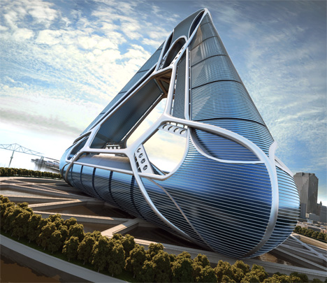
Rebuilding New Orleans is an ongoing effort and pitching into the concept-zone is the New Orleans Arcology Habitat or NOAH. Since the details on this structure are in-depth and plenty, lets plunge into them right away. NOAH proposes to be a habitat for 40,000 residents who can benefit from the planned residential units, school system, commercial, retail, hotels, casinos, parking, and public works facilities.

NOAH is based upon the following preliminary program outline.

1. Residential Units / Rental and Condominium; 20,000 units @ average 1100 Sq ft
2. Three Hotels; Average 200 rooms plus associated services
3. Time Share Units; 1500 units @ average 1100 sq ft
4. Three Casino Facilities
5. Commercial Space / Rental and Condominiums; 500,000 sq ft
6. Commercial Space / Retail; 500,000 sq ft
7. Parking Garage / within foundation; 8,000 cars
8. Cultural Facilities; 100,000 sq ft
9. Public Works; 50,000 sq ft / includes storage
10. District School System; 100,000 sq ft
11. District Administrative Office; 50,000 sq ft
12. District Health Care Facility; 20,000 sq ft

Estimated Total Square Footage : 30 million

Location/ Site Specific:

In reviewing all the options and possible sites for NOAH, the most logical location is on the Mississippi riverfront and adjacent to the Central Business District.

Design Challenge:

1. The first challenge is to overcome both the physical and psychological damages of recurring severe weather patterns. Though re-population has begun, the need to provide a stabilized and safe environment is paramount to a long term recovery and economic well being of New Orleans.
2. The second challenge is that New Orleans has too much water. The city has been built at and below sea levels which creates consistently high water table and makes it prone to flooding and storm surges.
3. The third challenge is that New Orleans is built on soil condition which consists of thousands of feet of soft soil, silt and clay. These conditions make building large scale concentrated structures difficult.
Believing that NOAH is a viable plan, our solution to overcome these challenges is to take advantage of these seemingly conflicting issues with the introduction of a floating urban platform.

Foundation Design / Basin

The NOAH foundation system is twofold. The first part of the system is to create a water filled "basin" within which the urban platform (NOAH) will float.

The second part of the system is to create a multi-cavity "hull" which will be the actual foundation for the superstructure.

Basin/Foundation:

The water basin will be a combination of carving into the existing land and extending out into the Mississippi River.
This man made basin is estimated to be 1,200 feet in diameter with a depth of 250 feet.
The walls and floor of the basin would be constructed of high strength concrete with applied lateral bracing and exterior attached tension rings.
Backup intact valves will allow basin and river water levels to remain constant.

The Foundation:

Noah, at its current height of 1,200 feet will rest up its triangulated foundation constituted
to be a buoyant multi-cavity "hull." This "hull" will consist of high strength concrete cells, forming approximately a 40×40 matrix. This matrix not only gives buoyancy to the structure, it also becomes the framing matrix for the steel framed superstructure. It is estimated that the combined weight of NOAH will draft 180 feet within the water-filled basin, allowing a minimum 50 foot space between the floor of the basin and the floor of the buoyant foundation.

The hull will accept all land connectors as flexible conveyors to take into account any movement.
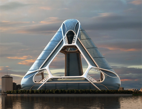
A triangulate shape has been chosen as the basis for NOAH. For two reasons:

First, the triangle is inherently the most rigid of all structural framing systems. The system is designed to dissipate gravity and severe wind loads through an all-steel applied (eko skeleton) exterior frame and conventional internal framing methodology.

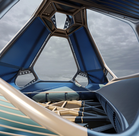
Second, the triangle is an "open" frame configuration, dividing NOAH into three separate "towers" converging at the top. The intent of this open system is to allow all severe weather /winds to in effect "blow through" the structure in any direction with the minimum of massing interference.

Some Other Features:

1. Sky Gardens will be inserted into the three main towers every 30 floors. These sky gardens provide landscaped glass enclosed atria.
2. Vertical commuting within NOAH will be supported by a series of local and express custom canted elevators.
3. NOAH is geared to an all pedestrian environment. Accordingly, only select horizontally based areas will be fitted with moving walkways and/or electric train carriers.
NOAH is a three phase master plan with a proposed 10 year build out. This time frame can be reduced to an estimated 6 years should demand accelerate.

Eco-Highlights:
The structure is designed to expand the horizon of sustainability and will seek LEED certification.
It will eliminate the need for cars within the urban structure, and thus becomes a carbon neutral entity. Internal electric transport links, vertical and horizontal, create a pedestrian-friendly community,
Some of these elements are secured wind turbines, fresh water recovery and storage systems, passive glazing system, sky garden heating/cooling vents, grey water treatment, solar array banding panels, and river based water turbines.

New Orleans Arcology Habitat or NOAH by E. Kevin Schopfer in collaboration with Tangram 3DS

noah2

noah3

noah4

noah6

noah7

noah8

NOAH Team

Design / Concept:
E. Kevin Schopfer AIA, RIBA

Executive Architect:
Ahearn / Schopfer Associates; Boston, MA
Cambridge Seven Associates, Inc.; Cambridge, MA

Associate Architect:
Raymond C. Bergeron, NCARB; New Orleans, LA

Visual:
Tangram 3DS; Kittery, ME

Structural / Mechanical:
Arup; Boston, London

Foundation Consultants:
Acergy; New Orleans, LA


This email was sent to gongyesheji1@gmail.comCreate Your Account
Don't want to receive this feed any longer? Unsubscribe here.

No comments:

Post a Comment