Yes, I said supermarket.
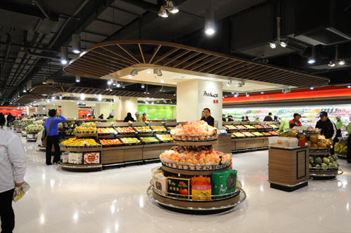
HEAD Architecture and Design stepped up to the challenge to create what might be the loveliest supermarket I've ever seen.
From the architects:
Lotus is a well established brand in China with 70 supermarkets across the country. In an effort to appeal to discerning shoppers in the Pudong area and to compete with the many new luxury food brands moving in to the Shanghai, Lotus commissioned HEAD to develop a new flagship store transitioning from 100% local brands, toward a larger component of foreign products and services.
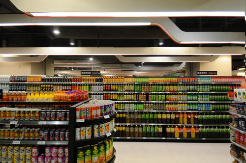
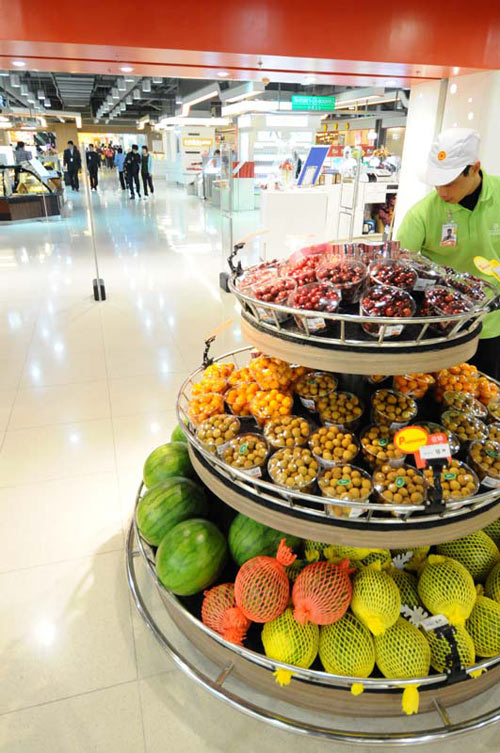
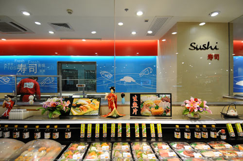
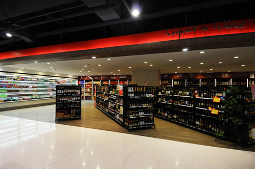
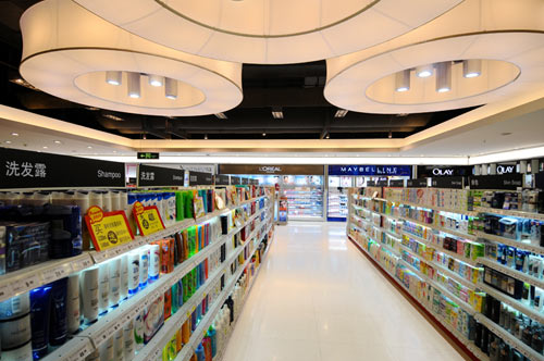
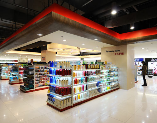
The store has been re-planned around two main areas. Firstly a fresh section, followed by the dry area which encompasses non-food, beauty and preserved items. Many demonstration areas feature tables and customisable columns.
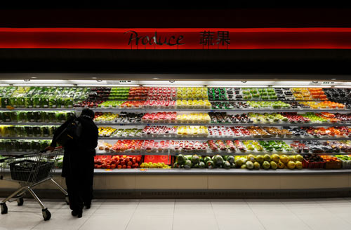
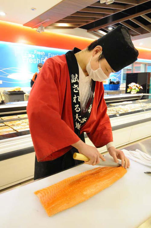
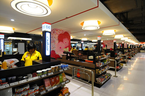
New chilled display counters are combined with back wall super graphics and timber canopies. New low-level shelving and counters across the fresh area create clear vistas to the back wall making the store feel larger and more open. The open market appearance is further enhanced by open ceilings and a set of store graphics that incorporate clear hand scripted fonts in Chinese and English. New staff uniforms and training were a key component in the successful relaunch of the store in January 2010.

No comments:
Post a Comment